The Timeline is a visual planning view for a programme. Instead of reading the profile as a list of elements with numeric offsets, the timeline draws the whole programme profile/pathway along a time axis, so you can see when each module, questionnaire and content page becomes available to the patient, and how the workload is distributed across the weeks.
The timeline works on the same programme profiles that are described in Program Profiles. It is essentially a different way of viewing and editing the same setup, not a separate configuration.
The timeline is currently available to activate per organisation, using the toggle under Experimental features under Settings.
CONTENTS
- Where to find the timeline
- Timeline structure
- Reading an element on the timeline
- After the active period
- Saving your changes
- Related articles
Where to find the timeline
Open a programme and choose the Timeline tab, which sits between Content and Settings. If the tab is not shown, the functionality has not been activated for your organisation.

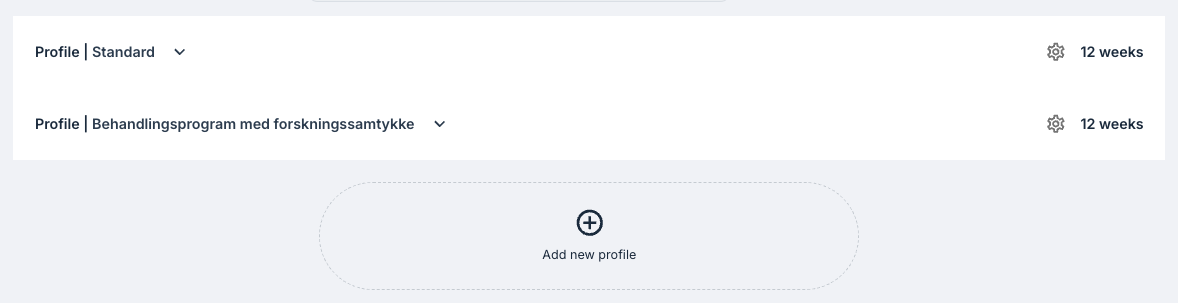
Each programme profile is shown as a collapsed row. Clicking a row expands it and draws that profile's timeline. You can also add new profiles from this page.
Timeline structure
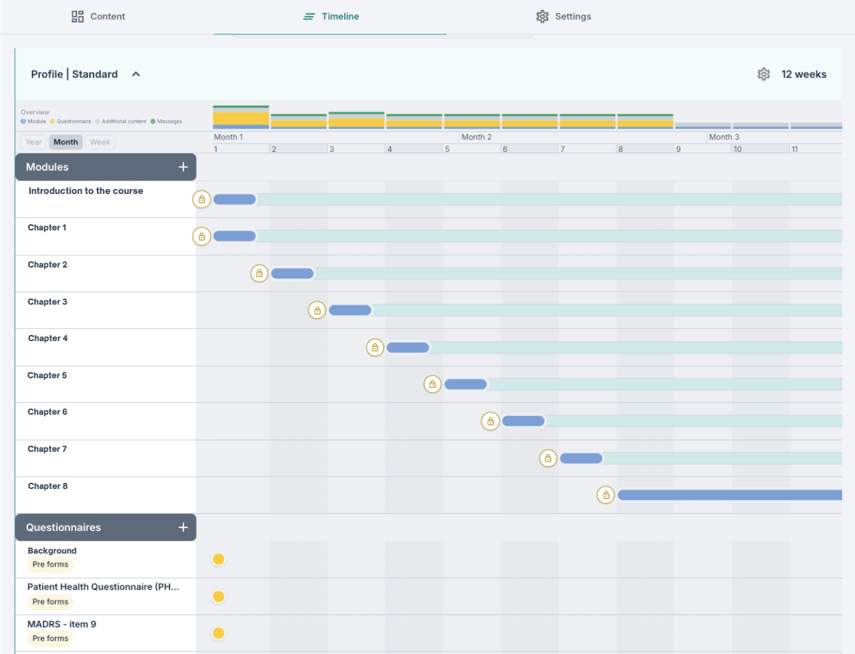
Profile header
The header shows Profile followed by the profile name, and on the far right the duration of the profile, such as 12 weeks. The duration is taken from the profile's own active period, and falls back to the programme's notification settings if the profile has not set one.
Hovering over the header reveals a small set of buttons: cancel, save, copy and a handle for reordering the profile. A cog symbol opens the settings panel for the profile. These are described in Program Timeline: Managing profiles.

Overview chart
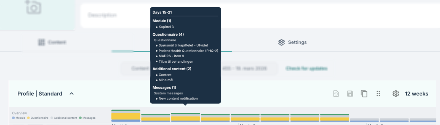
Directly under the header is the Overview chart. It groups the profile into blocks of seven days and draws one stacked bar per block. The height of the bar reflects how many elements are active in that week compared with the busiest week in the profile, and the colours within the bar show how that activity is split between modules, questionnaires and additional content.
Hovering over a bar shows which days it covers and lists the elements behind each colour. The chart is only drawn when the profile contains activity.
Time scale
Below the overview is the time scale, with three view buttons on the left: Year, Month and Week. The selected view changes how the axis is divided:
- Year – years on the upper row, months on the lower row.
- Month – months on the upper row, weeks on the lower row.
- Week – months on the upper row, and the first day number of each week on the lower row.
The lower row is also drawn as alternating light and dark bands behind every element row, so the same divisions can be followed down the whole timeline. Switching the view only changes how the axis is drawn, it does not change any setting on the profile.

Row categories
The timeline is divided into four sections, each with its own dark header bar:
- Modules – the modules that have been added to the profile.
- Questionnaires – questionnaires and other scheduled forms.
- Additional content – content pages, worksheets and other elements of type Other.
- Messages – scheduled messages.
The first three sections have a plus symbol in the header for adding elements. Sections without content show a placeholder such as No modules. On the left of each row is a fixed column with the element name and, where relevant, a coloured chip showing the element group, such as Pre forms and Consent.
The area to the right of this column is the graph itself which will slowly be populated as you work on the profile. Long programmes scroll sideways while the name column stays in place.
Reading an element on the timeline
Elements may be drawn differently depending on what they are:
- Modules and Additional content are drawn as bars. The bar starts on the day the element becomes available and ends on the day it stops being available.
- Questionnaires are drawn as circular points, one per occurrence. A questionnaire that repeats has several points, joined by a dashed line.
- Scheduled messages are drawn as envelope symbols on the Messages row.
Hovering over a bar or a point shows the day it falls on, for example Day 7 or Day 7 - Day 14. Day 0 is the day the programme is assigned to the patient.
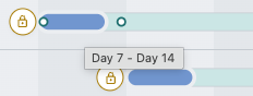
A lock symbol may appear at the start of a row. This indicates conditional opening, and is described in Program Timeline: Element settings and conditional opening.
After the active period
Elements that are placed beyond the active period of the profile are not drawn on the main axis. Instead a narrow strip appears at the far right of the graph, separated by a vertical line, and those elements are shown there in green. This keeps the main axis proportional to the active period while still showing that content exists after it.

Saving your changes
Edits made on the timeline are held in the browser until they are saved. While there are unsaved changes, the save and cancel buttons become available both on the profile header and at the top of the settings panel. You will also notice a chip with Unsaved changes after you have made edits in the profile, as a reminder to save your progress.

Related articles
We now recommend browsing through the following articles to learn in more detail how you can create and edit profiles on this Timeline page:
Was this article helpful?
That’s Great!
Thank you for your feedback
Sorry! We couldn't be helpful
Thank you for your feedback
Feedback sent
We appreciate your effort and will try to fix the article